Moved Text Visualization on Wikipedia
My Role
UX Designer
Methods
User Centered Design, Clickable Prototyping
Tools
Figma, Invision
Timeframe
1 week
Team
Jan Dittrich
Taking inspiration from metro maps around Berlin, this project visually handles how to show moved text on Wikipedia and provides a mechanism for moving from the old position to the new one.
Brief
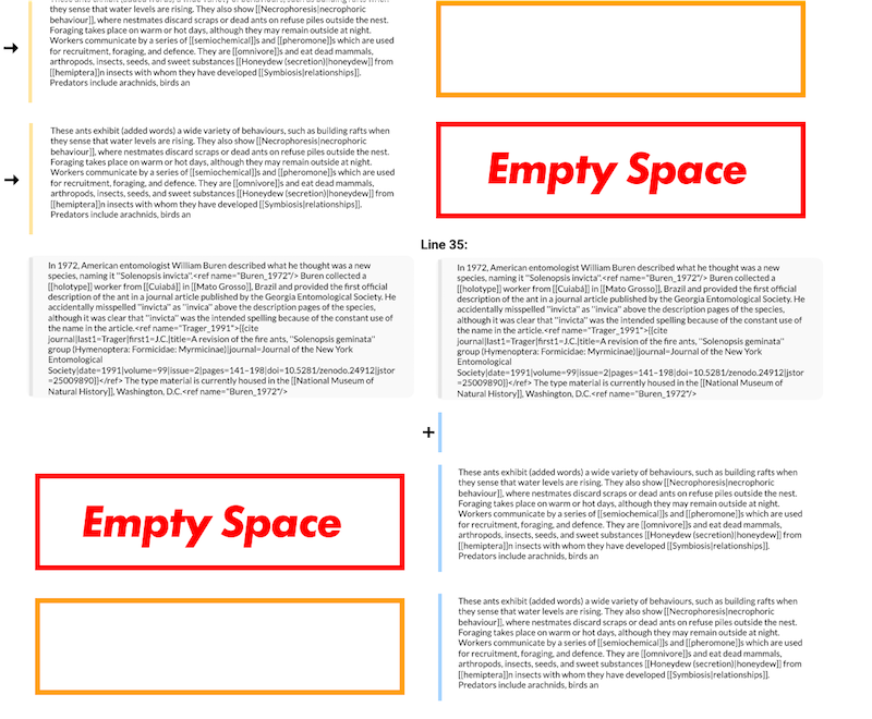
Working within our existing system for showing edited text (the two column diff view) how can we more effectively show moved text chunks?
Findings
After spending some time using the existing diff view, I hypothesized that current users would have to use the gaps between boxes to differentiate between added text and removed text when scanning for changes instead of the icons. After confirming that this was the case with a small sample of Wikipedians, I determined that the center space could be utilized without disturbing the way people work with the tools currently, which is often a concern on an incredibly legacy system like Wikipedia.
Solution
The solution resembles a metro map to show where text was moved to. There is also a button that follows Wikipedia's style guide to allow users to automatically scroll the page to where text was moved to or originated. It also uses a hover effect to clearly show the connection.
Next Steps
The next step would be user testing with a prototype that works on actual data. I would do this by conducting a Think Aloud test. After iterating as needed, it would move to production. You can follow this feature's progress here.